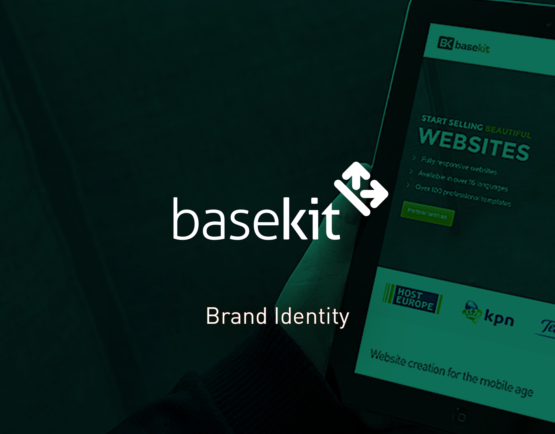
Overview
Basekit is an online website builder that simplifies the way the world makes websites. It is now present in a global market, including Brazil, Latin-America, Spain, France, United Kingdom and Germany.
Challenge
Evolving in a very positive way, basekit is now in a major transition with the release of the latest version of the online editor. Because of this, BaseKit found that this would be the best opportunity to make some adjustments in their image and adaptation to current reality.
Solution
The idea of the logo came up from the balance between the etymological definition of words base + kit and the conclusions taked from the branding workshop.
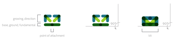
Was explored to show the sense of fundamentalism, the “root” that grows in a positive direction, as a set,
a conjunct, also without forgetting that it is a digital company, with sense of commitment and trustful to their clients.
The image resulted pretend to be versatile to the distinct audience that varies between web designers, students but also business.
The logo was build to allow for Future evolutions.
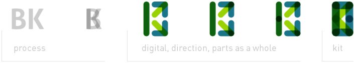
Base + Kit – Exploring the Definition
![]()
Base (noun) > bottom, fundamental, basis, foundation
Base (botany) > point of attachment, root
Something before, first, fundamental – like happens in the makeup
Kit as a tool – collection of tools – objects
Kit as a team – collection of efforts – people
Symbol
Construction Stage 1 | Exploring the right shape
 Construction Stage 2 | Exploring the concept
 Construction Stage 2 | Elements weight and balance
 Colour Scheme
 Typography

