
EXPERT REVIEW
Tesco Neighbourhood Food Collection
URL: http://foodcollection.tesco.com/
Client: Tesco
Date: July 2014
Tesco wondered whether there were improvements made to the overall site structure, taking into account also the mobile experience. We were asked to review the site and put together in a document our UX recommendations?
GENERAL OVERVIEW
Tesco Neighbourhood Food Collection aims to encourage Tesco customers to take action and help stop people from going hungry in their community by donating in-store or online. As an incentive Tesco tops-up all donations by 30%.
Thanks to extensive research on decision-making, we now know there are broadly three physical parts of the brain that evaluate action. One part deals with quick, gut-reaction decisions and responds best to a visual message. Another part listens to how we’re feeling and responds best to an emotional appeal. Finally, there’s a separate part that deals with rational evidence. It lets us weigh up the pros and cons before making a decision.
RESEARCH
I have put together a document, based on research and best practices. Before starting to get into detail in the NFC website review I found it was crucial to do research to find out and understand – WHAT DRIVES PEOPLE TO DONATE?
We then looked at Neighbourhood Food Collection’s current website and understood how we could improve its performance to inform, encourage, and celebrate this good cause. I tried to capture the most relevant aspects to communicate to the client what improvements could be further investigated.
WEBSITE IMPROVEMENTS
After the research phase and having in mind the project scope I proposed 5 high-level recommendations with based evidence:
1 STORYTELLING – Users spend 10-20 seconds on average on a site. The visit can last longer if we can hold people’s attention. I understood that there was a lack of human touch and users were not immediately creating an emotional connection. To solve this issue I suggested rearranging the content, bringing the user’s stories to the top, showing compelling images, and telling authentic stories to build a cohesive and engaging narrative to encourage people to take part.
EVIDENCE  2 CTA’s – Donate / Get Involved – Paring up with the real stories is very important so users can see a strong CTA on how to donate/get involved or get to know more. Actually, the second top-read FAQ is “Is there a way I can donate anytime?”. A highlighted “Donate Now” link in the sticky navigation menu would allow visitors to get involved. Also, we recognised we could add another CTA within the story to reinforce the need. It’s not just about giving money, is important for users to see the real impact of their donations. How they are contributing? Where is their money going to be invested? Users want to feel good and recognised.
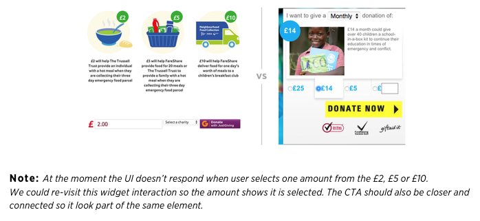
EVIDENCE  3 RATIONAL – As I previously mentioned, different parts of the human brain will determine our decision to give. When we are not sure what to do, we take clues from others like us. Social information is a powerful tool and so, when emotional and logical appeals from the charity aren’t quite enough, we should include evidence of what other people have done before. There are many ways to convey this idea, but building on what we already had we could use the infographic style section and work on those numbers so they could explain their meaning and tell a story easy to retain by our users (eg. how we got from 0 to 15.3, how many people this project covered, users “money journey”). It is very powerful to bring this to life and contribute to building credibility through rational evidence.
EVIDENCE
 4 USER JOURNEY – Users often leave a webpage when they don’t find what they are looking for so it’s important to understand users’ expectations on their visit, what triggered them to come to this page, where did they come from (eg. in-store Ad or advised by their local church), what are they expected to take from their visit or what is the follow-up.
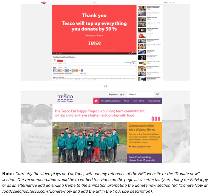
One of the issues identified in the website is that we had several links driving users outside the main page (eg. <watch our animation> prompts users to the YouTube platform).
My recommendation was that the user experience would be empowered if the page contained a cohesive story. Embedding the NFC animation on the homepage or as an alternative playing it in a light box are quick ways to improve the website performance.
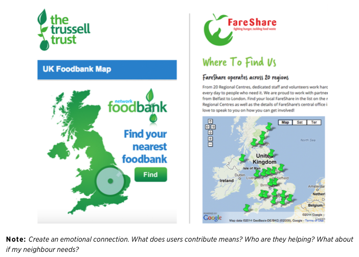
Bringing also some more engaging elements to the page such as the map widget API from the partnered charities sites could encourage users to check and take part in what’s happening in their local communities, or make their lives easier when they are looking for the nearest food bank.
EVIDENCE 1
 EVIDENCE 2
 5 GENERAL IMPROVEMENTS – In addition to the previously recommended, suggestions were made regarding the interaction design to improve the website response, particularly to rethink the carousel functionality and interaction, to link the current Tesco logo to the top of the page as a good emergency alternative to the scroll up once the users are far down the page and to get the rollover mouse interactions consistent across the site.
EVIDENCE
 Additional Notes

