BakingMad.com is the UK’s most visited baking website offering a “multi-channel personalised baking advice”.
It sets itself apart from the competition by being the number 1 place to go for everything someone needs to become a better baker.
Baking Mad wants to establish itself as the “Trip Advisor for home bakers” by 2016. Which means that the platform should be known as a one stop shop for baking advice and inspiration.
To get there Baking Mad outlined a 3 year brand strategy that develops the platform step by step.
Key objectives are:
1. Brand business objective: Extend the BakingMad.com reach from 2.3 million to 4 million per month by 2016
2. Be the first point of contact for novice eager bakers by engaging them with content and raising awareness by communications
3. Develop a deeper relationship with enthusiastic bakers by raising the awareness of credibility, engaging content, member benefits and more social interaction
4. Drive consumption of Silver Spoon home baking brands by being more transactional, educational and promotional about the products
CHALLENGES
Our main challenge was: how do you create an innovative website that will cut through in what is an increasingly crowded sector?
The current infrastructure and design are very outdated. The platform needs a giant leap forward.
Cooking and baking are territories that are very sensitive. Trust is super important to not deter any users. For that reason the role of the brand in connection with Silver Spoon, Billington’s etc must be clearly defined and visible.
The brief is very tactical. Managing expectations and communicating the vision in an aspirational and easy understandable way is important.
USER CASES
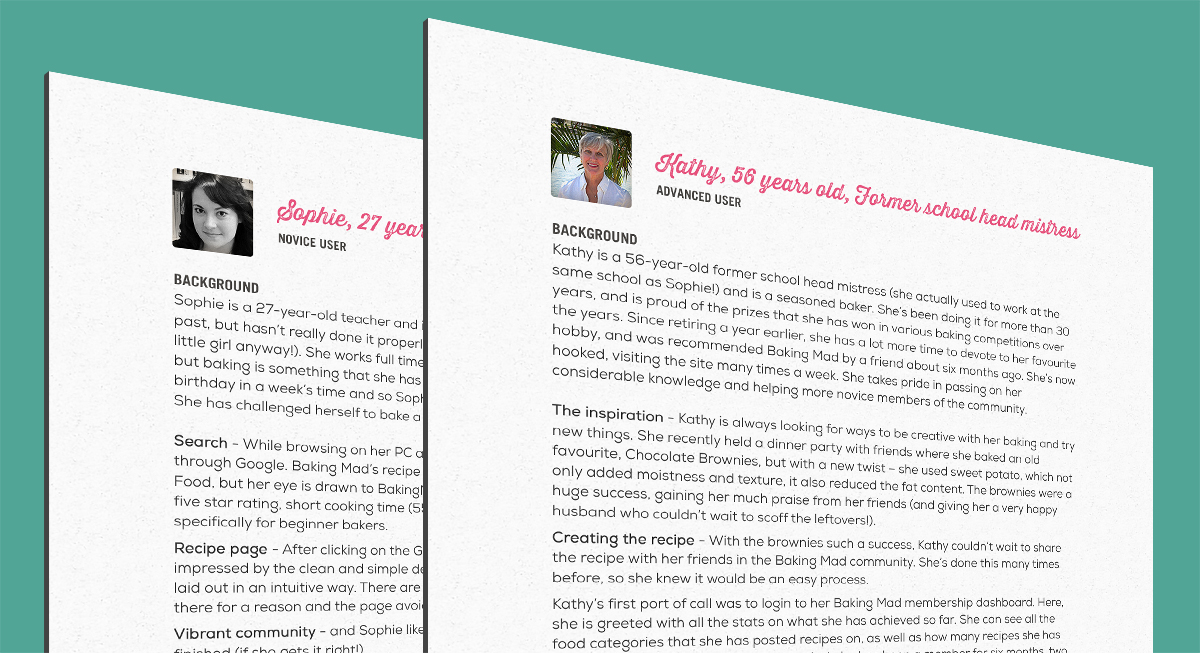
Understanding the target audience is a very important thing for any website. In order to test the ideas and hypotheses, we built 2 fictional characters from the task audience of Baking Mad website and analysed what needs they were expecting to meet on the site, which functions could be useful.
We wrote out all the existing and new features Baking Mad and sorted them according to the characters needs.
USER SCENARIOS
To be sure the choices of functionality covered the needs of the target audience, we created a couple of user scenarios, based on the previous user case personas.
STYLE TILES
The only brand asset Baking Mad had prior to our redesign was their logo. Working together with the Head of Design at Zone, our first job was to establish the brand’s visual language. We started off by producing style tiles to try and capture the brand’s personality. We came up with four options – retro cookbook, classic kitsch, cake shop and modern patisserie. The retro book was the one we chose to go with.
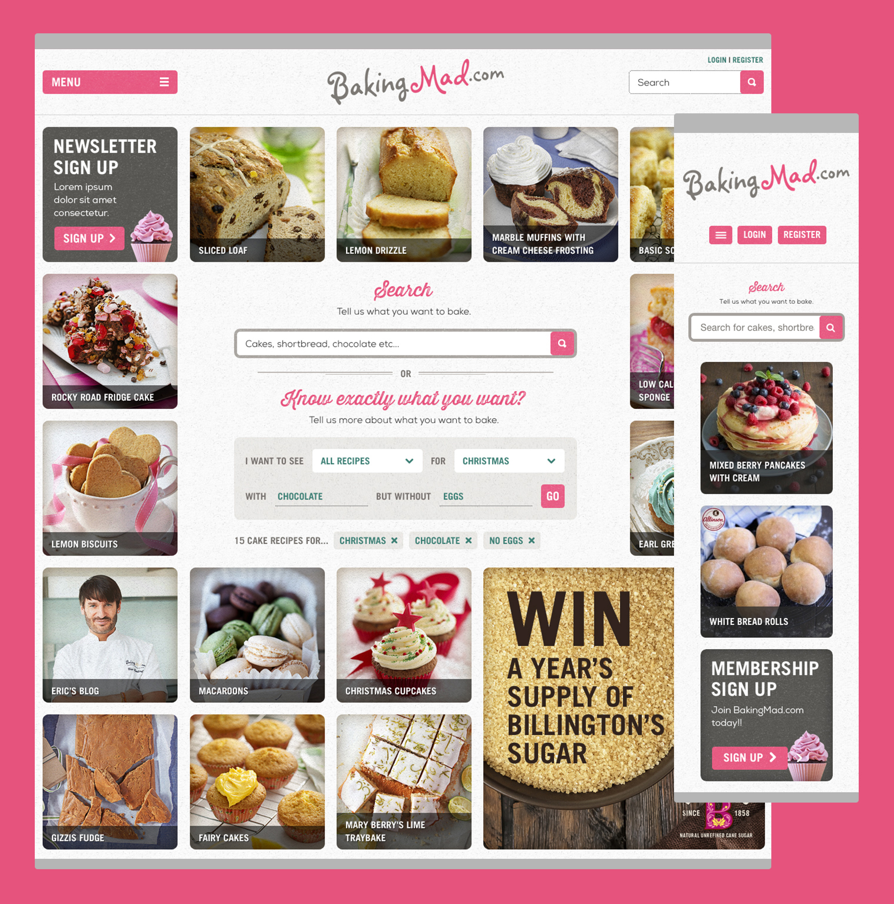
HOMEPAGE
With the homepage, we wanted to do something quite different and groundbreaking. Baking Mad has a library of over 2000 recipes, and we wanted to make the homepage a really direct, streamlined way to access them. It’s focused around a full width grid and dynamic search that updates in real time as the user filters down to what they want. We wanted the grid to have an eclectic feel to engage the user, with recipe content mixed with promotions and other areas of interest.
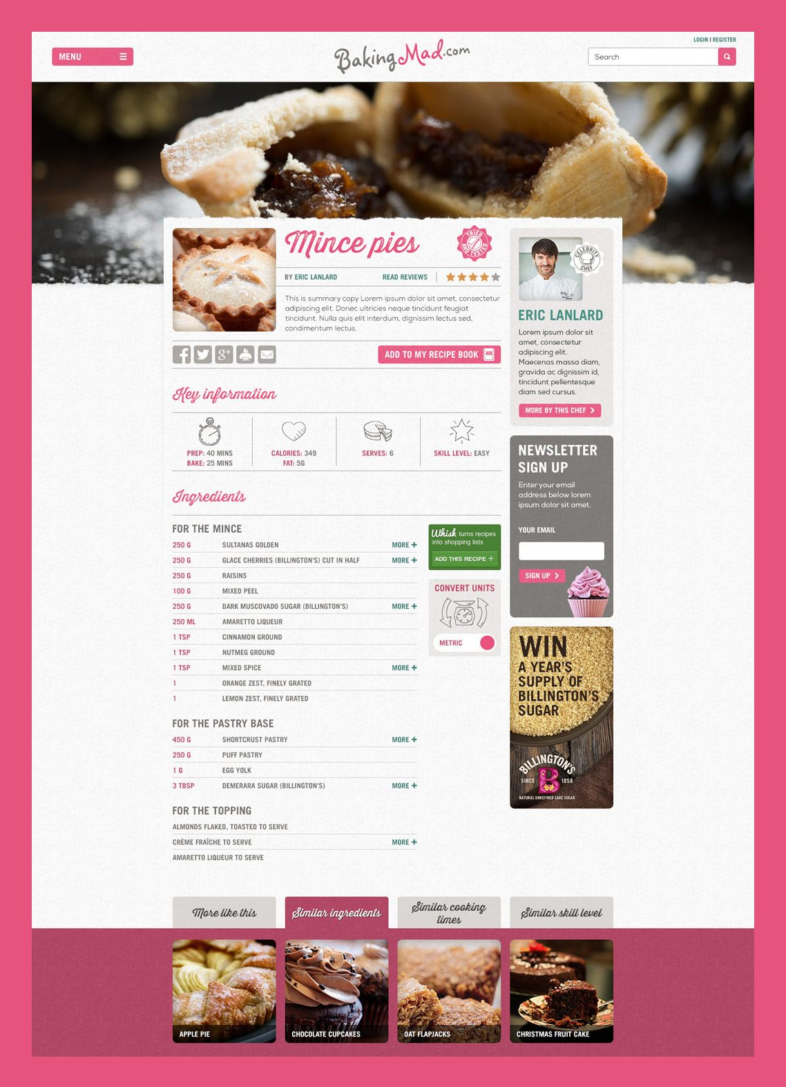
RECIPE PAGE
As one of the most important pages on the site, one of the key challenges we had in the recipe page was balancing the need to do something innovative with making sure we weren’t moving too far away from convention.
DISPLAYING IMAGES
Another challenge was how to display the main feature image for the recipe page. Food imagery is a key component in making the recipes appealing, but the solution had to work across all of their 2000+ recipes – all quite different in size, so we designed a number of different solutions to understand what the best could be.
CHOSEN DESIGN FOR RECIPE PAGE
In the end the square option was chosen as it was the most versatile.
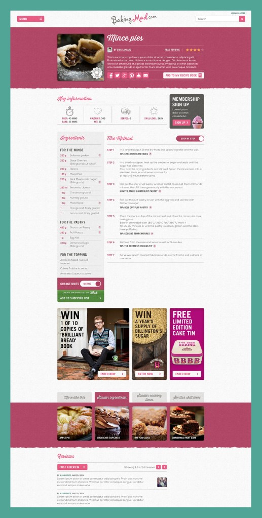
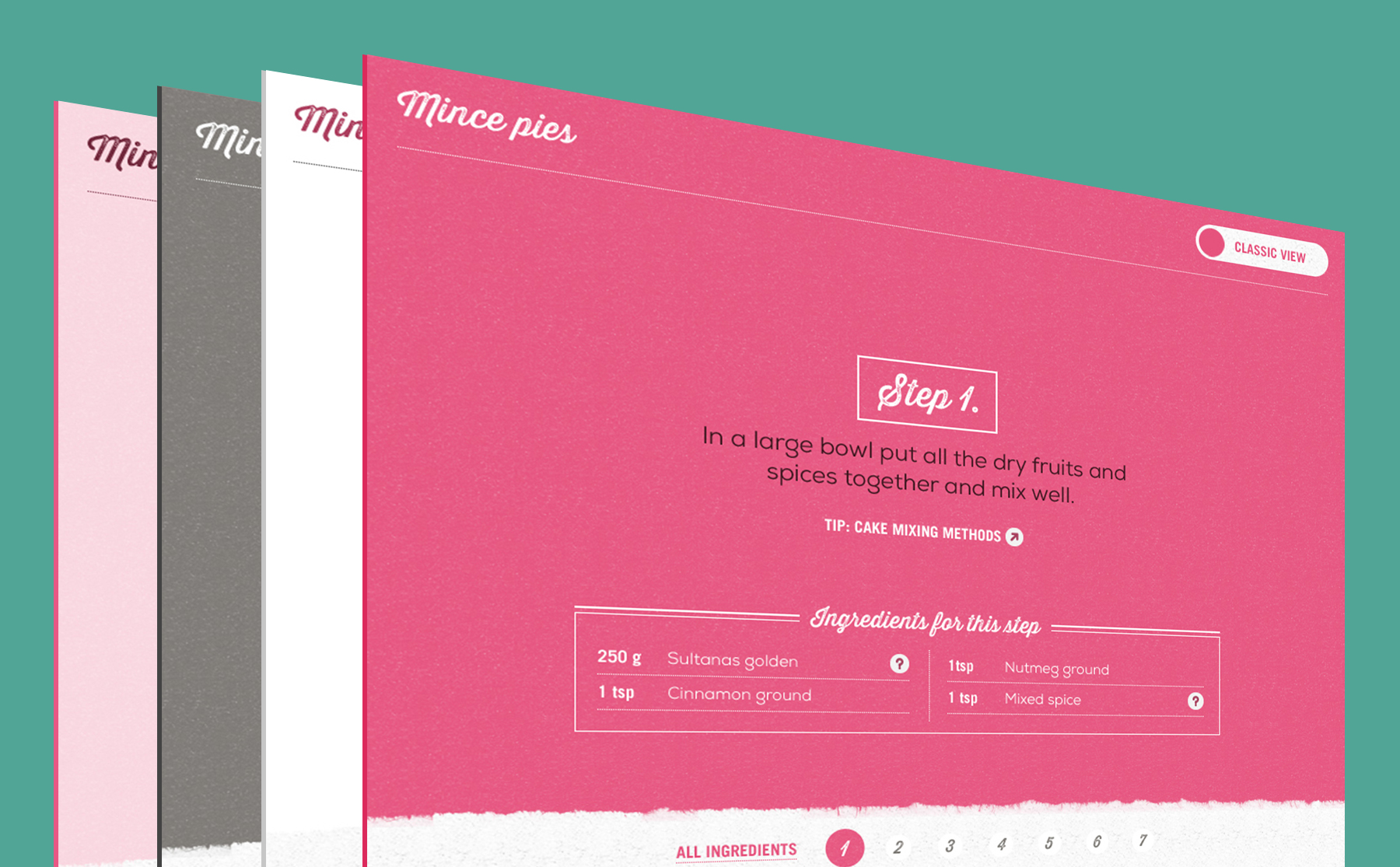
BAKE MODE
To make our recipe page innovative, we came up with ‘Bake mode’ – a truly unique feature that allowed the user to switch between the more traditional ‘classic’ recipe view and this full screen, step-by-step mode.