CHALLENGE
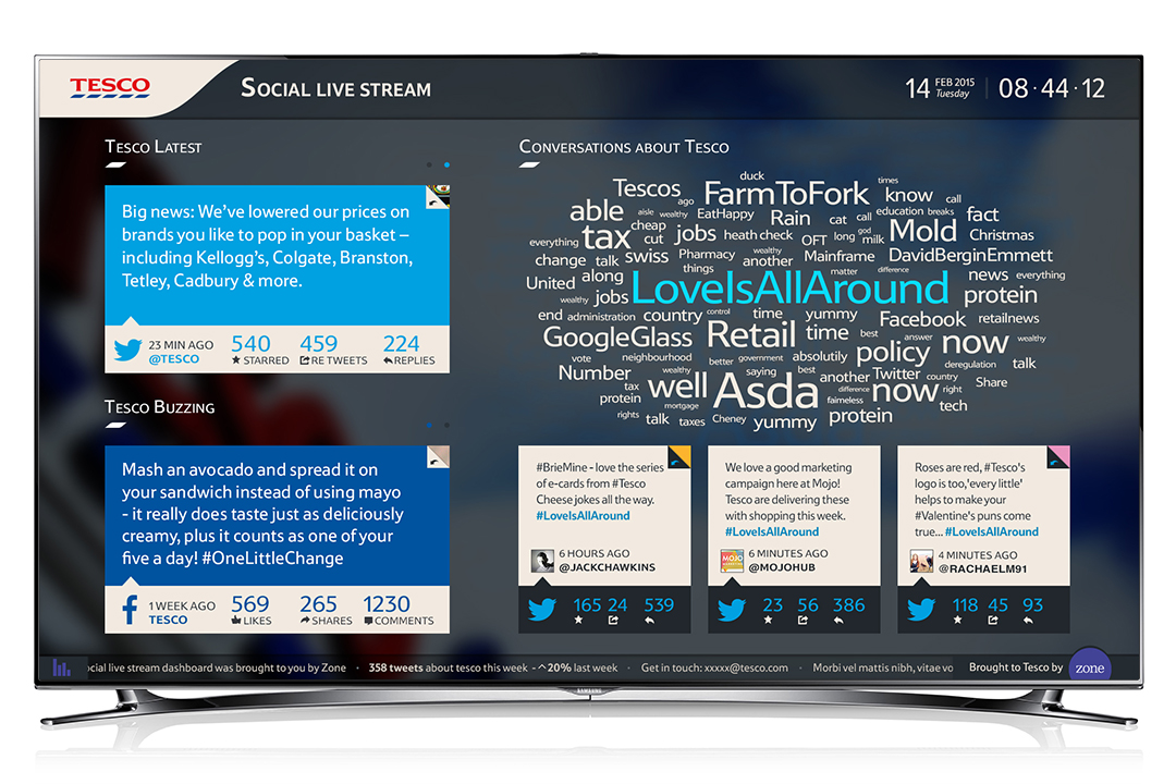
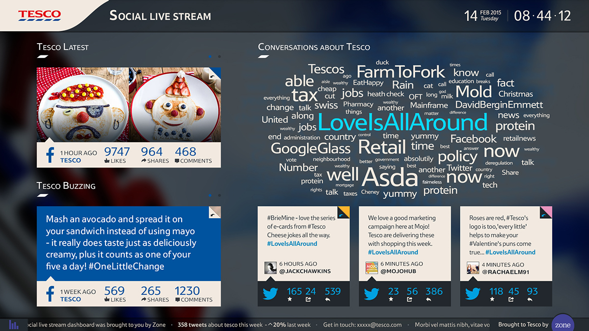
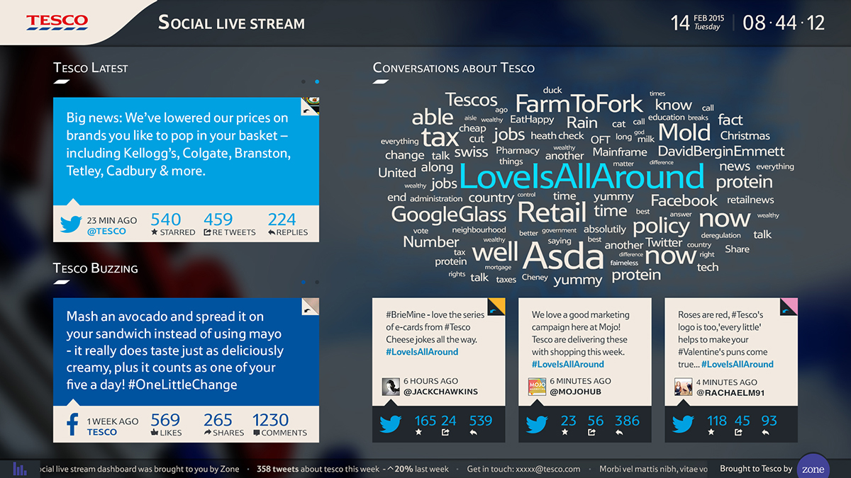
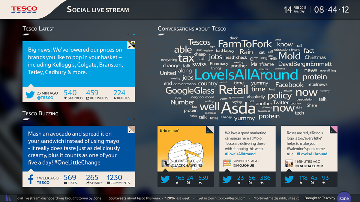
The Tesco dynamic dashboard is a live view of what Tesco is saying in social media – Tesco Twitter and Facebook page(s) – and also what others are saying about Tesco. It was an initiative from the Tesco brand social media team so they could keep an eye on the impact and opportunities social listening and social media can leverage for the business.
TOOL GRANULAR OBJECTIVES:
1 Highlights Tesco’s social media activity breaking this down to their:
1.1 Amplification rate
1.2 Conversation Rate
1.3 Applause Rate
2 Tesco´s conversations happening at that time
3 Popular trends across the internet
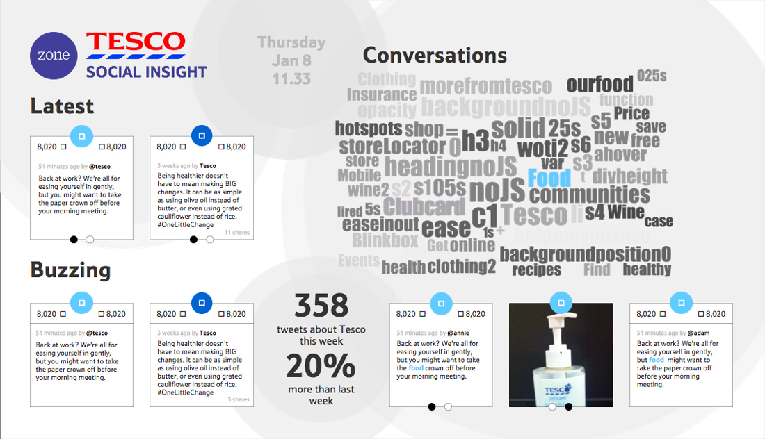
Wireframe
Despite being a great start, as soon as we started the Visual Design, we realised there were things that needed to change in order to convey the medium specs. The cards on the left hand side for distance readability reasons had to become a single.
MOOD BOARDS
To initialize the design process, I collected the mood board. It contains everything that could inspire me to find the better, more creative and easier to use solutions, helping me to define the look and feel of the coming design.
This helps, not only to create the best user experience, but also to have an idea of how it could be designed.
I have come up with 4 different mood boards – one featuring mostly layout styles, another one with infographic styles, another one with colours and finally one with loads of different ‘card design’ styles. With the mood boards printed and on the table the team could quickly define what we liked or not and also routes to explore in the Visual Design phase.
 VISUAL DESIGN
Coming up with the visuals for the Tesco Dynamic Dashboard was a really fun, dynamic and interactive process. I got all the team involved, specially the developers so we could streamline the process and meet a tight deadline. We were all really excited with the nature of the project. Specially because this project demanded a substantial amount of experimentation and testing as TV is not a medium were not used to work. It demanded completely new accessibility standards and specifications, colours, font-sizes, distance of readability, etc. Another big challenge was on how to make the visual piece work both with Tesco branding and to be accessible on TV. Adding to this, we needed to make this template quite generic so it could be re-used by Zone across different client groups (e.g. Coca-Cola).
The final result is just spot on. Both Zone and Tesco are really happy and we are currently scooping for new functionality to be soon integrated.